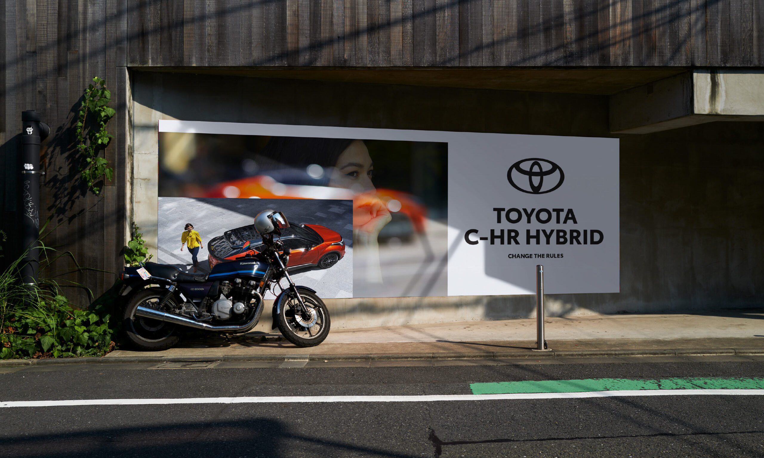
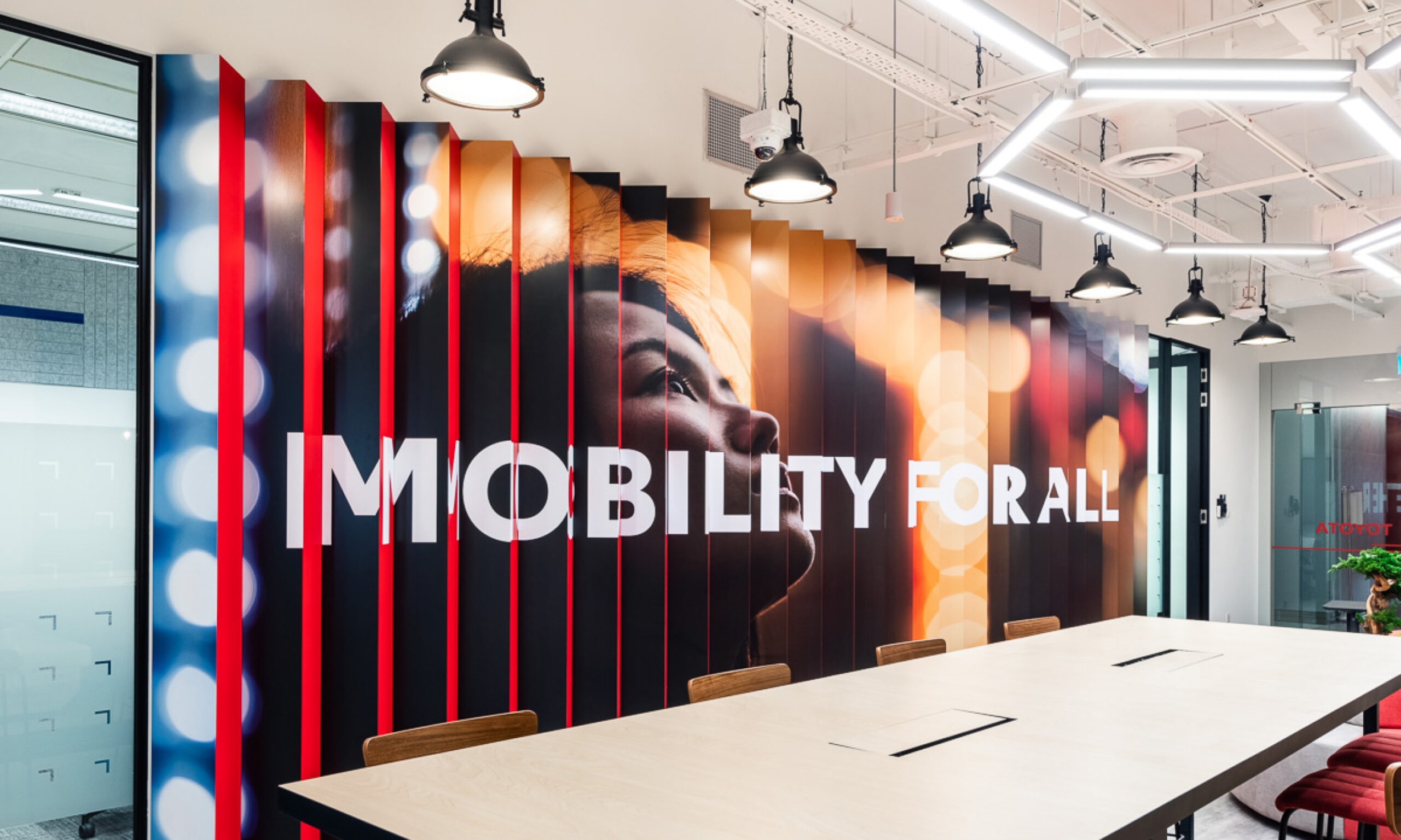
Competition, disruption and rapid change across the automotive industry demanded brave thinking to maintain Toyota’s leadership and relevance amongst new generations of drivers. To face this challenge, Toyota’s Japanese headquarters, for the first time in its history, set a new global vision transforming from a car company to a mobility company; working towards ‘Mobility for All’ to better connect with tomorrow’s drivers. How each global region creatively embodied this vision was their own decision to make.

Our objective was to interpret ‘Mobility for All’ to create a regional brand to unite all 17 Toyota APAC markets, to create a stronger, more relevant, and more resilient regional brand – expressing Toyota’s story with character, emotion, and style.

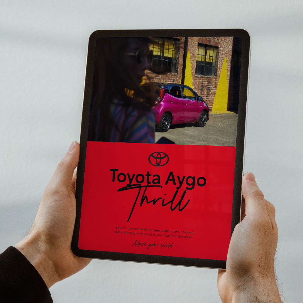

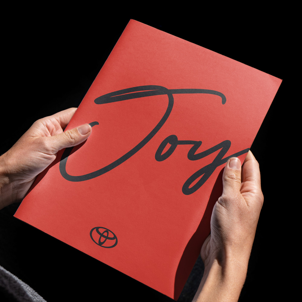
Core to the Toyota Asia rebrand was the introduction of a handwritten script typeface bringing Toyota’s new global vision of ‘Mobility for All’ to life.
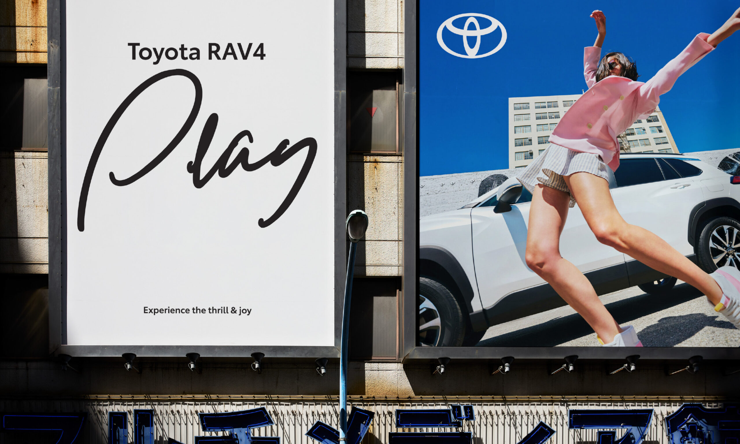
The irreverent script typography was designed to amplify action-inspired messaging, applied with freedom and attitude, disrupting the underlying design grid to ‘dial up the volume’ across communications.
Crafted with a world-renowned script typographer in collaboration with our creative team, the process to develop the typeface focused on creating expressive yet legible glyphs to connect a highly diverse region with a sense of freedom and human emotion, as demonstrated in successful application across multiple APAC languages.

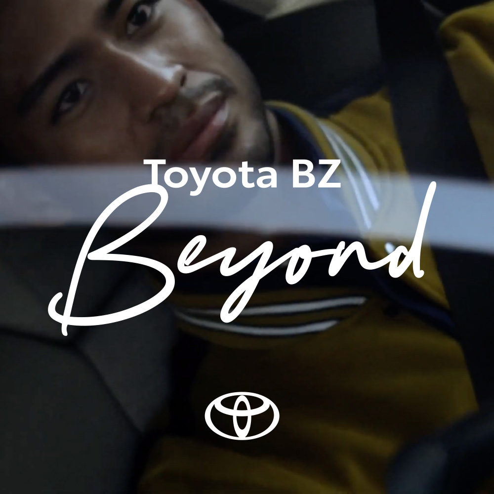
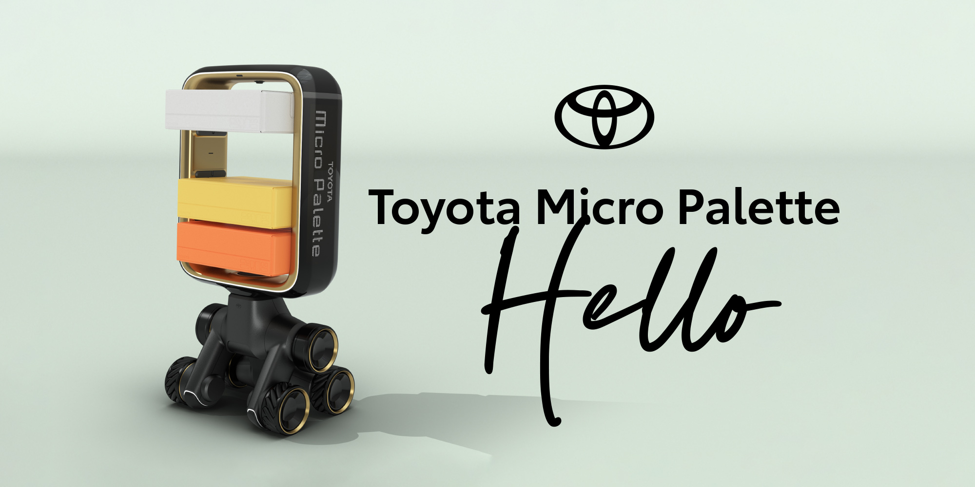
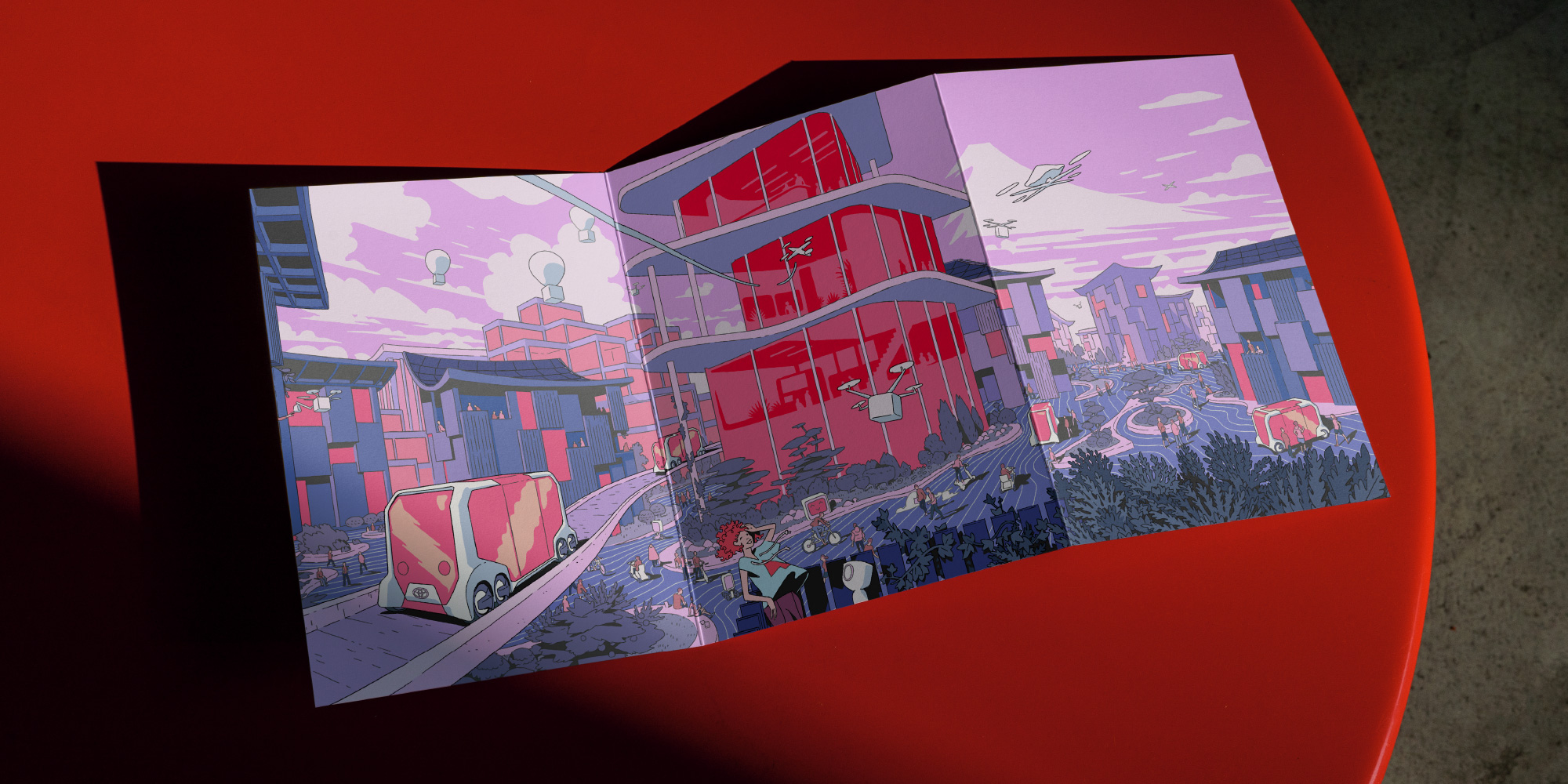
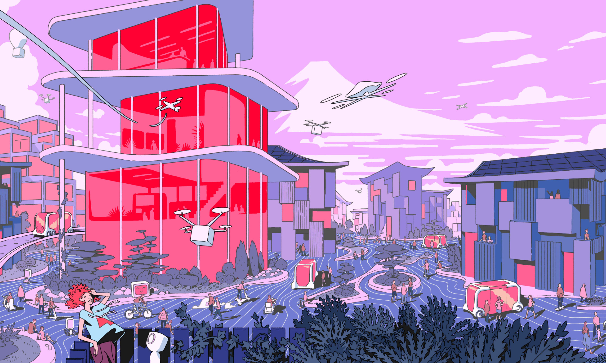
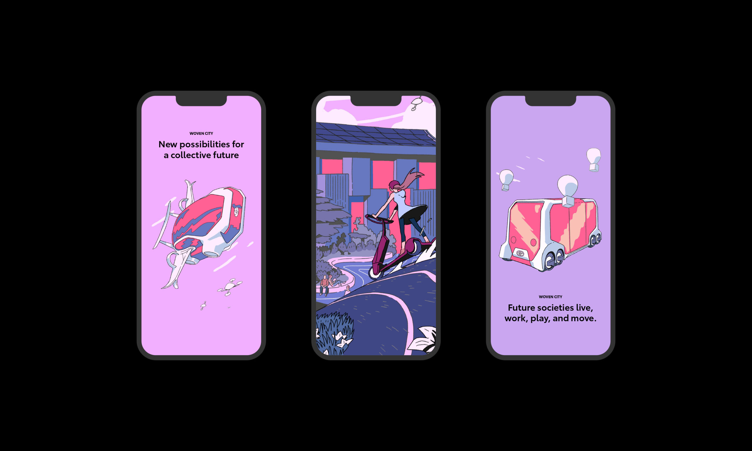
A flexible toolkit of logo variations, typefaces, graphic devices, primary and secondary colour palettes, photography, iconography and illustration further celebrate a sense of freedom and inspire creativity

Our flexible, intuitive design system delivered as comprehensive guidelines enabled markets to execute the brand vision ‘Mobility for All’ beyond traditional communications and customer touchpoints: to all classes of products, channels and services, successfully reframing the Toyota brand from being a marketing tool, to an all-of-business responsibility.
