Houston were briefed to establish King Street as the go-to destination for dining experiences in Brisbane. Given the up and coming precincts already established in market, such as James St precinct (Calile Hotel) and Fish Lane, the precinct required a bold, vibrant and contemporary identity to reflect its eclectic food and beverage offer.
Given the existing logo mark was developed at a stage when the site was under-development / not yet fully realised, there was a dissonance between the fun, quirky on-site experience and the current corporate and traditional logo.
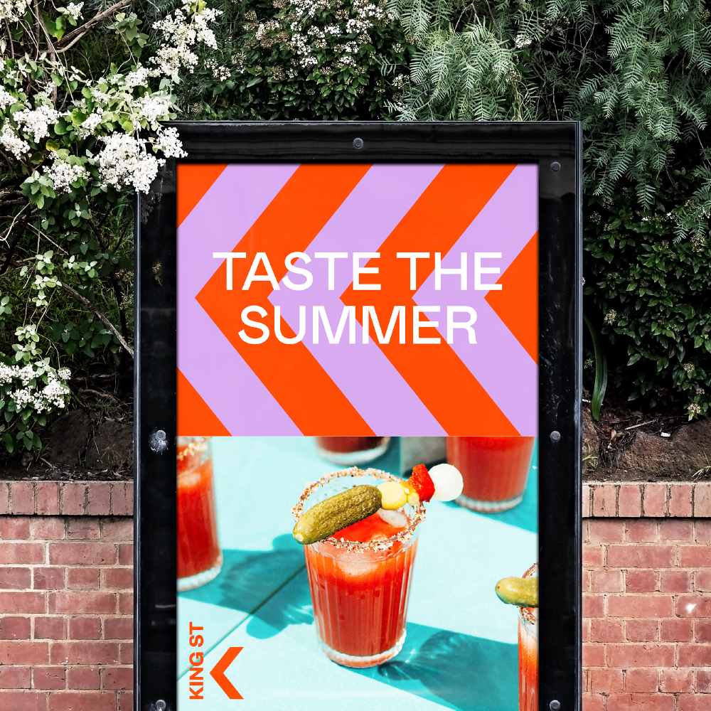
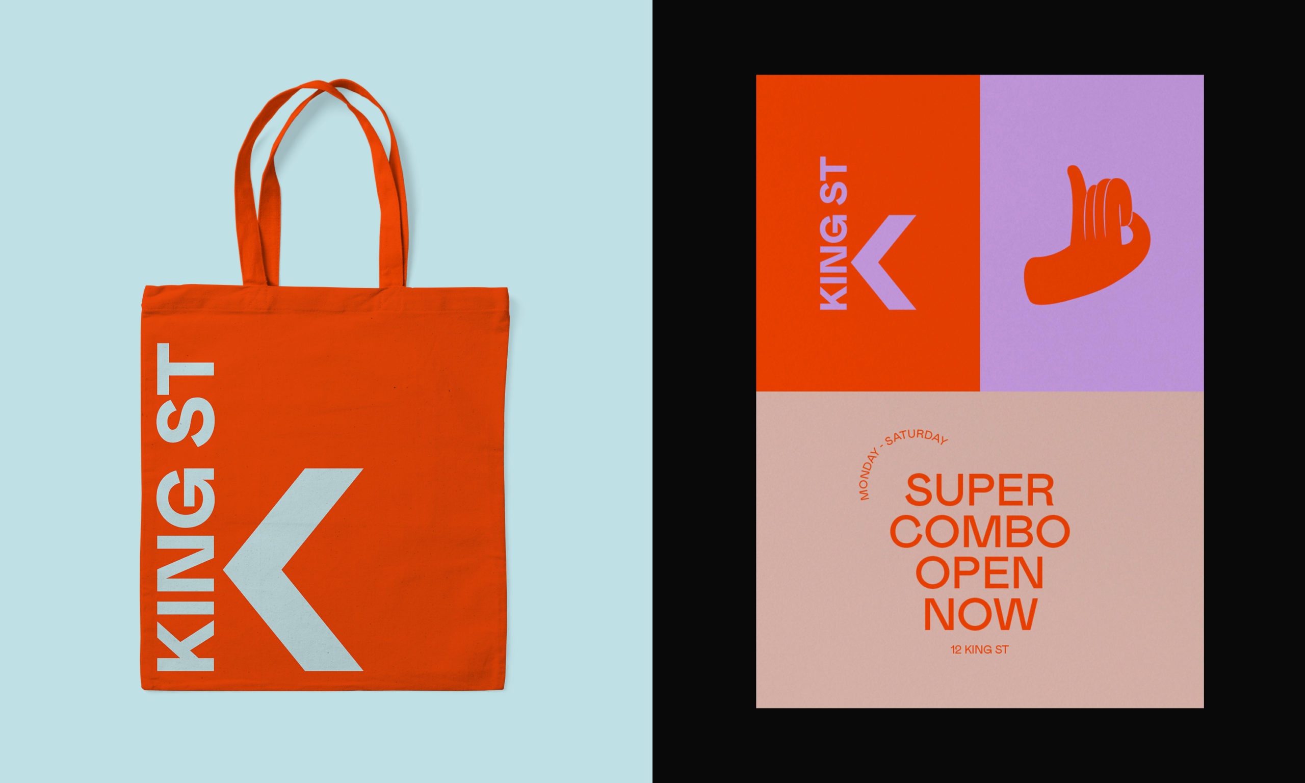
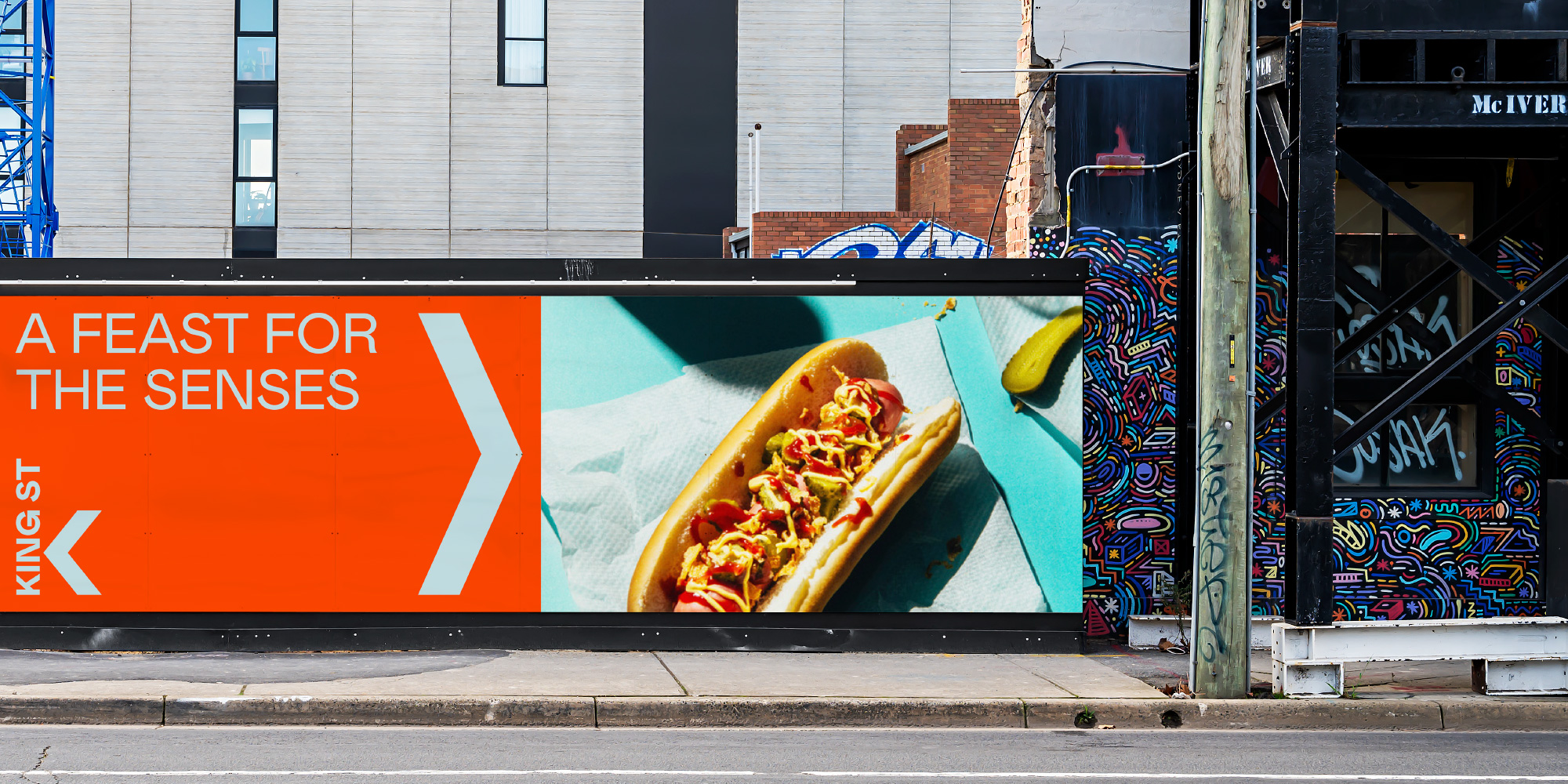
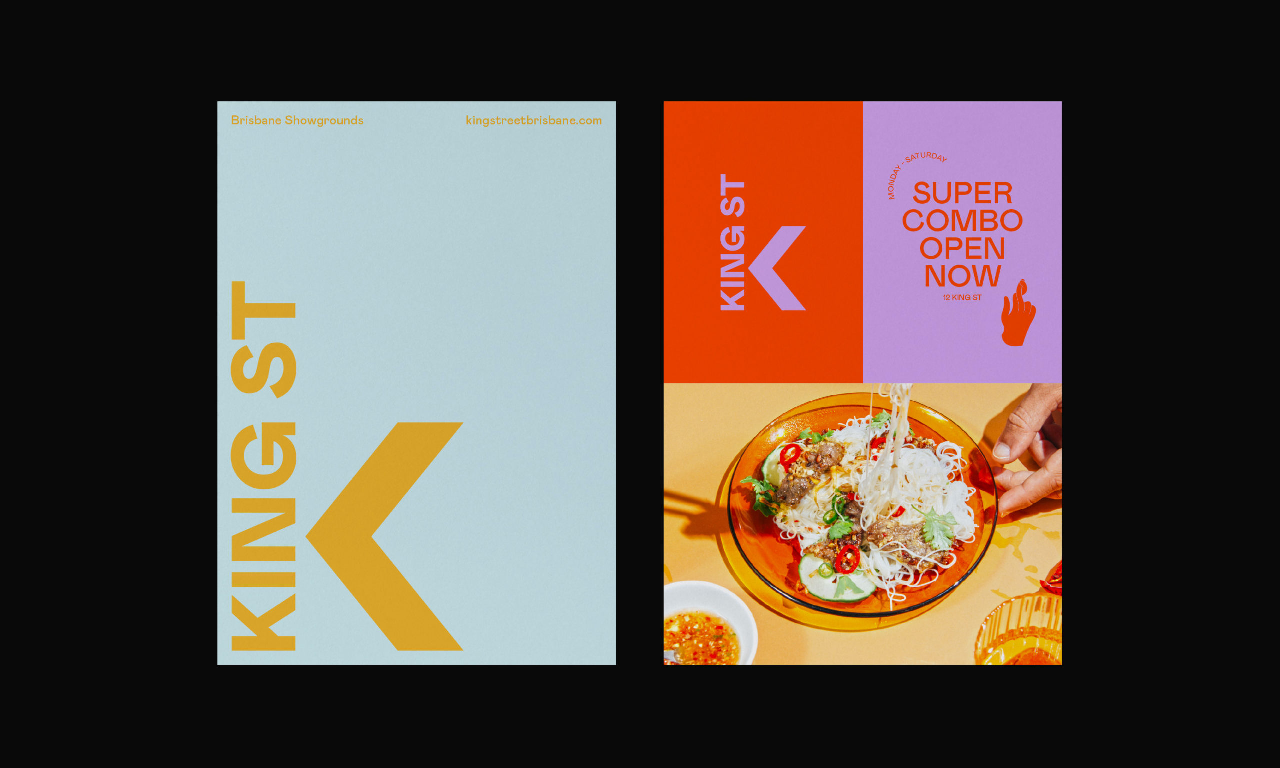
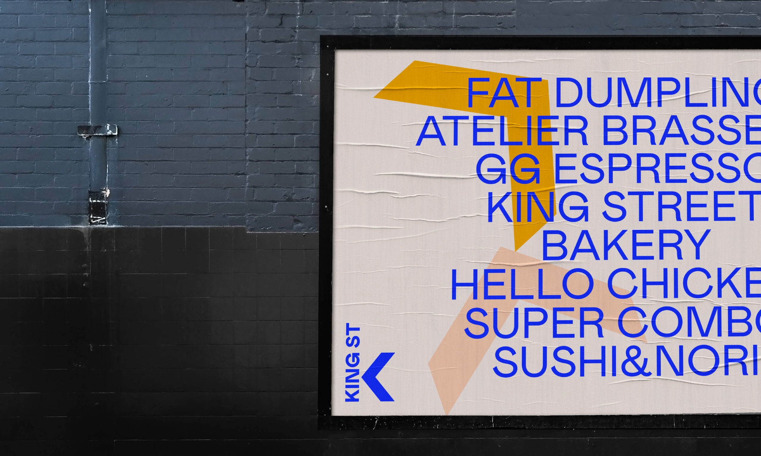
Following our development of the strategic positioning, ‘Disrupt your senses’, the next step was to revisit the logo/mark in the context of its current offering. The “K” became a central focus for the logo, acting as an “arrow” device which could be deconstructed and used within the identity system. The colours were inspired by the diverse and vibrant restaurants and retailers within the precinct – and were extracted based on the shop fronts and visual streetscapes. Neon signs, coloured tiles, vibrant green play areas, bright plastics and Mexican sombreros all inspired the final colour palette.
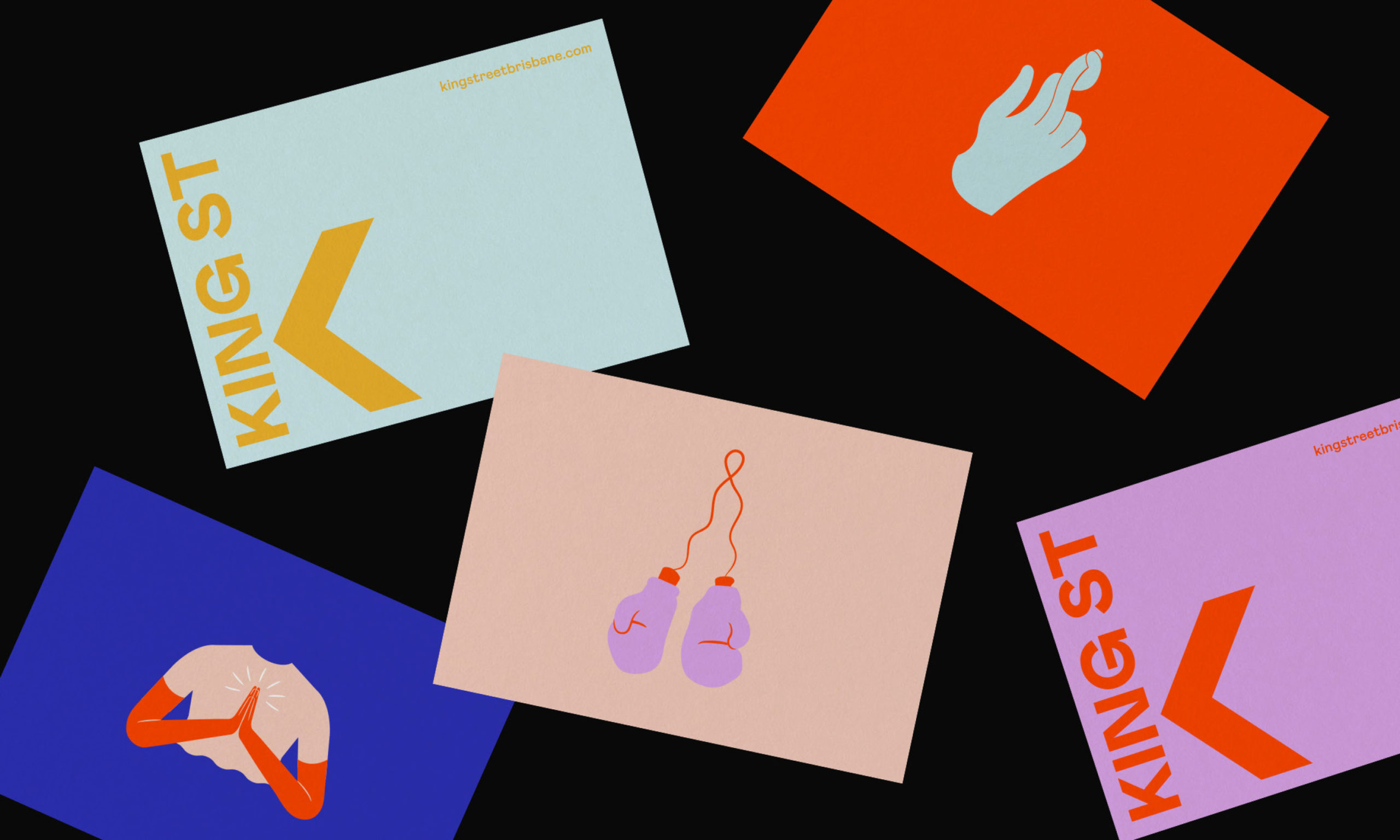
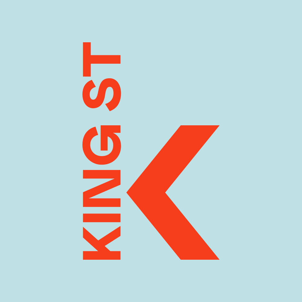
The “K” became a central focus for the logo, acting as an “arrow” device which could be deconstructed and used within the identity system
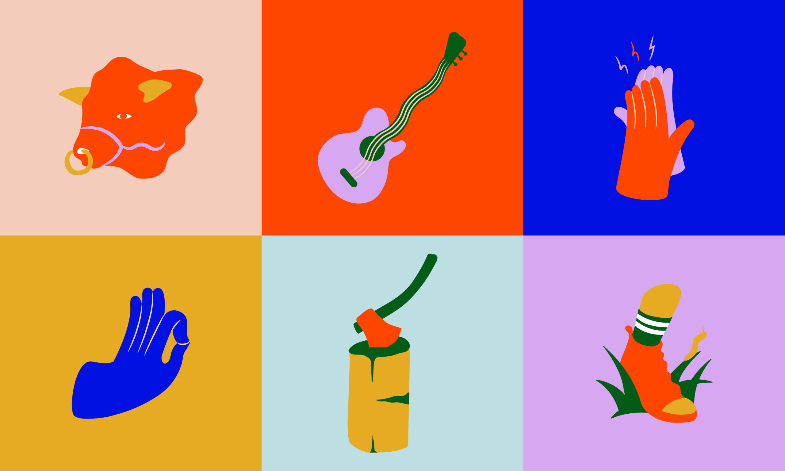
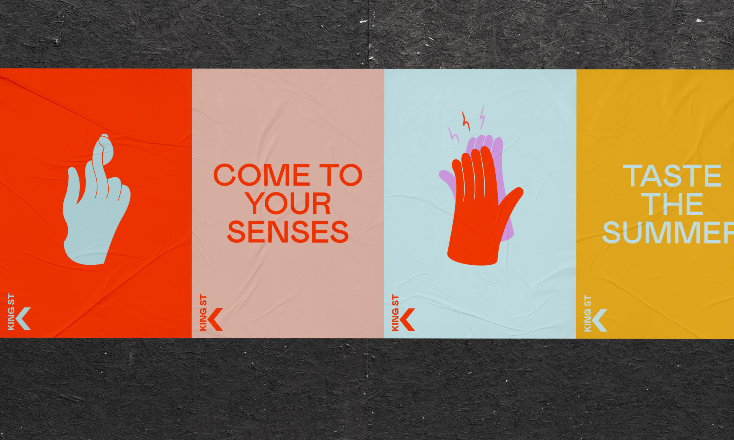
The identity is supported by commissioned illustrations by Leon Shore. His quirky and playful designs captured the spirit of the modern place, but also its history.
The overall design system is a celebration of all things sensory; touch, taste, smell, sight and sound – and captures the unique experience King St offers within the context of the broader Brisbane Showgrounds destination and Brisbane city.
