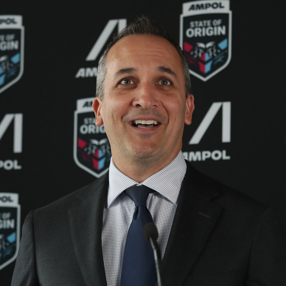
An ongoing partnership
Working with Ampol since 2015, Houston has been the ongoing strategic brand partner leading the transformation of the business brand portfolio and internal culture and purpose programs.
A new future
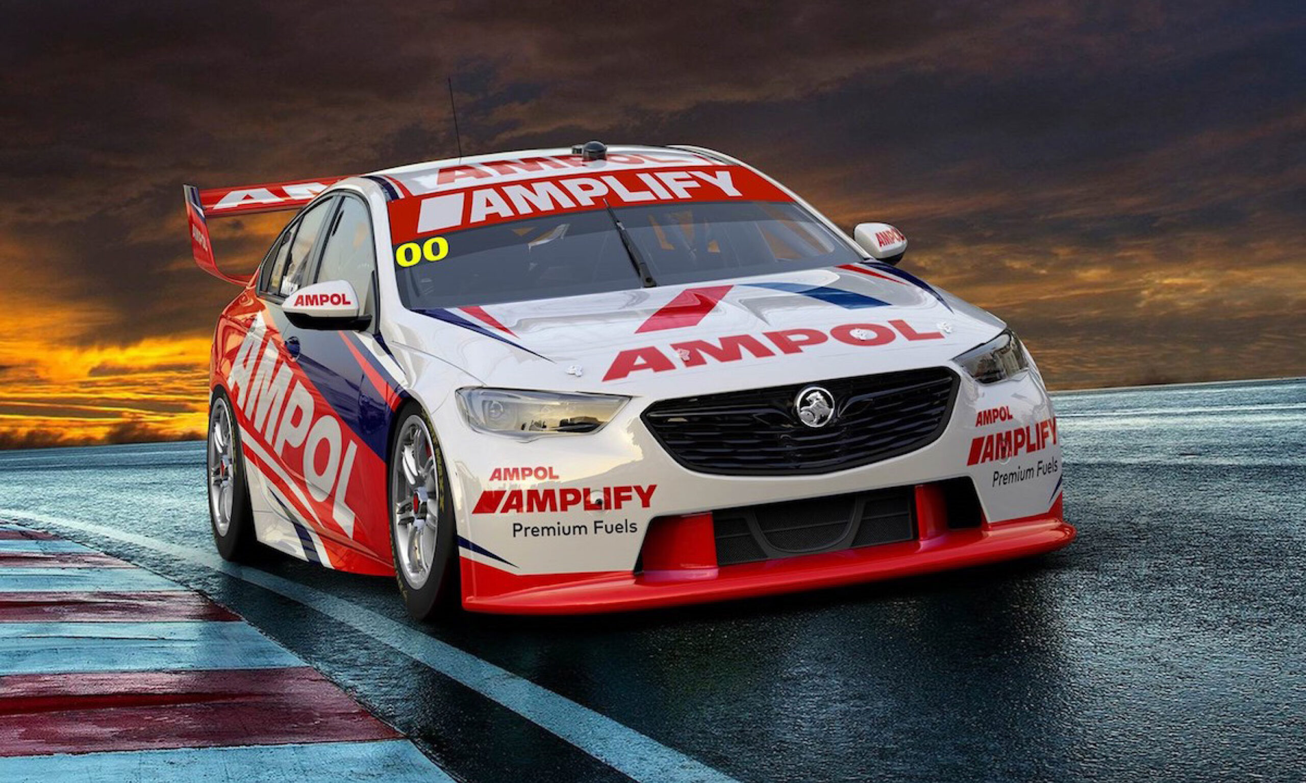
A change in circumstances meant we needed to explore options for an alternative fuel brand. As an Australian owned and operated company, it was imperative the new brand reflected not only Australia, but a new and future focussed Tier 1 fuel provider. Houston explored a number of hypotheses and scenarios for change and through rigorous consumer testing confirmed a revitalised Ampol was the right approach.
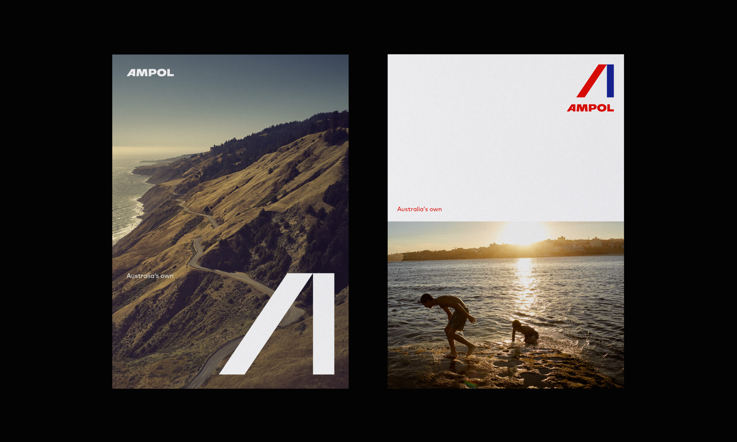
Bringing back an Australian Icon
The Ampol name will evoke fond memories for many Australians and the fresh modern mark will connect it with a new generation of customers.

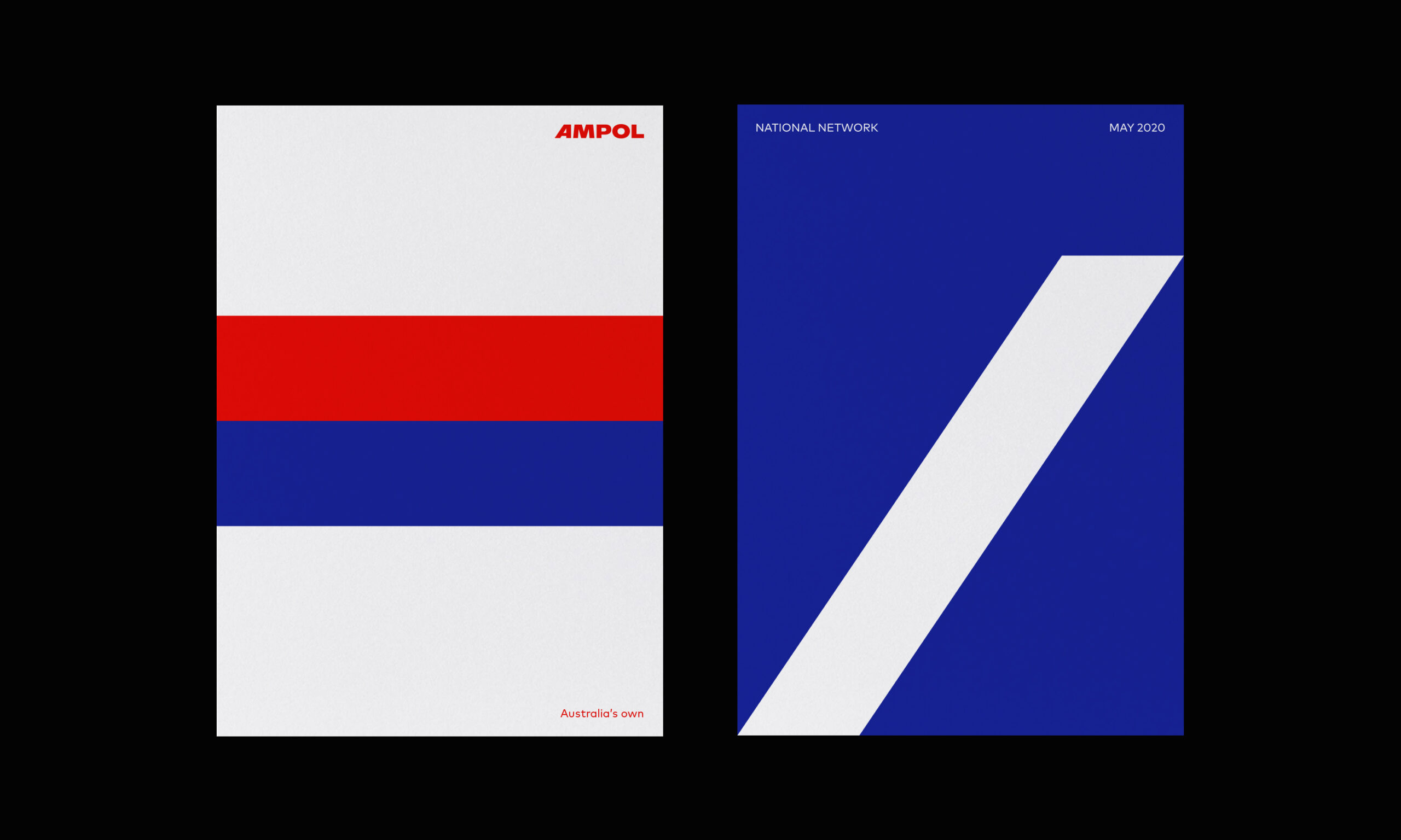
The new Ampol logo captures a nod to the heritage as well as a look to the future. The original red and blue bands and capitalisation of the word Ampol link with the heritage logo, while the new, modern and distinctive leaning ‘A’ symbolises forward momentum.
The new logo features bold custom typography to connect Ampol with a new generation of customers, priming Ampol to become once again Australia’s most loved and admired premium fuel brand—a simple, striking beacon for customers when on the road.


“The business needed to fast-forward twenty years of evolution whilst retaining its original DNA. The strong bands of the original logos and colours gave us the creative foundations of the new mark.”
“The new, modern and distinctive leaning A is the centerpiece of the new design, symbolising the brand’s forward momentum, and a more refined logo for today’s applications.”
Alex Toohey, Houston Group Executive Creative Director

“The return of Ampol is much more than a nostalgic play, with the brand retaining latent equity in Australia as a trusted Tier 1 fuel provider.”
“There is no doubt, however, that we as a nation have grown and changed since Ampol was last seen in Australia, and the contemporisation of Ampol was critical in bringing the brand back to life.”
Stuart O’Brien, Houston Group CEO & Founder


In collaboration with Ampol’s specialist fuel product team, we set out to educate and inspire the consumer with the technical advantages of Ampol’s innovative premium fuels. The solution was to create a 3D animation demonstrating the fuel’s journey through the engine, highlighting Ampol’s unique fuel additives as they clean, protect and optimise engine performance, at the same time showcasing the fuel functionality including high-pressure injector spray, combustion chamber, and compression and ignition within the cylinders. Executed in a cinematic, hyperreal style with great attention to mechanical accuracy.


“This is the right time for the company to transition to operate under the Ampol name, as it better reflects its position as an independent and growing company and as Australia’s leading transport fuels provider.”
“At the same time, the new Ampol logo reflects our growth and evolution into new markets and geographies and our ongoing drive to be world-class in everything we do. Our fresh new symbol will connect Ampol with a new generation of customers and underpins our commitment to again make it Australia’s most loved and admired fuel brand.”
Jenny O’Regan, Ampol Chief Brand Officer