Creating with curiosity for QT Hotels
Services
Brand Strategy,
Brand Identity,
Brand Positioning,
Branded Collateral
THE BRIEF
QT didn’t just arrive on the Australian boutique hospitality scene – they interrupted it entirely. A true individual, with the personality to disrupt the market and the brand experience to back it up.
Since then, the market has changed – and tastes have evolved as well. The idiosyncratic character that elevated QT previously had started to feel inconsistent and inauthentic.
The business had grown up and matured – and while QT still stood to celebrate individuality in a world less conventional, modern individuality had grown up alongside it.
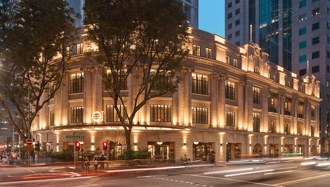
With their first international hotel set to open in Singapore, it was time to reflect on who QT was – and how they could offer a global market of tastemakers something captivating, curious and unmistakably QT.
Since then, the market has changed – and tastes have evolved as well. The idiosyncratic character that elevated QT previously had started to feel inconsistent and inauthentic.
The business had grown up and matured – and while QT still stood to celebrate individuality in a world less conventional, modern individuality had grown up alongside it.
With their first international hotel set to open in Singapore, it was time to reflect on who QT was – and how they could offer a global market of tastemakers something captivating, curious and unmistakably QT.
THE SOLUTION
“When the lines blur, extraordinary awakens.”
This is the essence that sits at the heart of the QT Hotels brand. A spirit of freedom, of expression and of curiosity, that sees each new hotel the group open feel both intrinsically QT and entirely unique.
Since curiosity changes shape from place to place, we engineered the strategy and the identity with room for local personalisation. Through the creation of bespoke framing devices, as well as localised imagery commissioned by a local artist.
For Singapore, that artist was Jill Tran – whose illustrations feature eye-catching motifs like a peacock in a shophouse, or two tigers having a tea party, with palms and archways from the hotel adding further detail. Alive with colour, they’re a surrealist wonderland for curious eyes and minds.
Defining and refining ‘taste’ and experience sets each QT apart, while bonding them together. QT Singapore was a chance to blur the lines and invite taste makers, with all kinds of curiosities, to be truly captivated.
THE RESULT
By making personalisation central to its identity, QT Hotels didn’t just arrive in Singapore; it reset its foundations for how it expressed modern individuality and invited curious tastemakers to dive deeper.
Jill’s illustrations and the bespoke graphic frames celebrate Singapore as a melting pot where east meets west, old meets new, manmade meets nature and straight lines meet organic forms. The identity creates a deep sense of place, which is now ready-made to be realised across future QT properties too. Authentic expressions of individuality are ready to be applied in new, but no less meaningful ways, over and over again.
The result is a hotel brand that feels alive, inviting, and unmistakably QT. No matter where the lines blur next.
Services
Brand Strategy,
Brand Identity,
Brand Positioning,
Branded Collateral
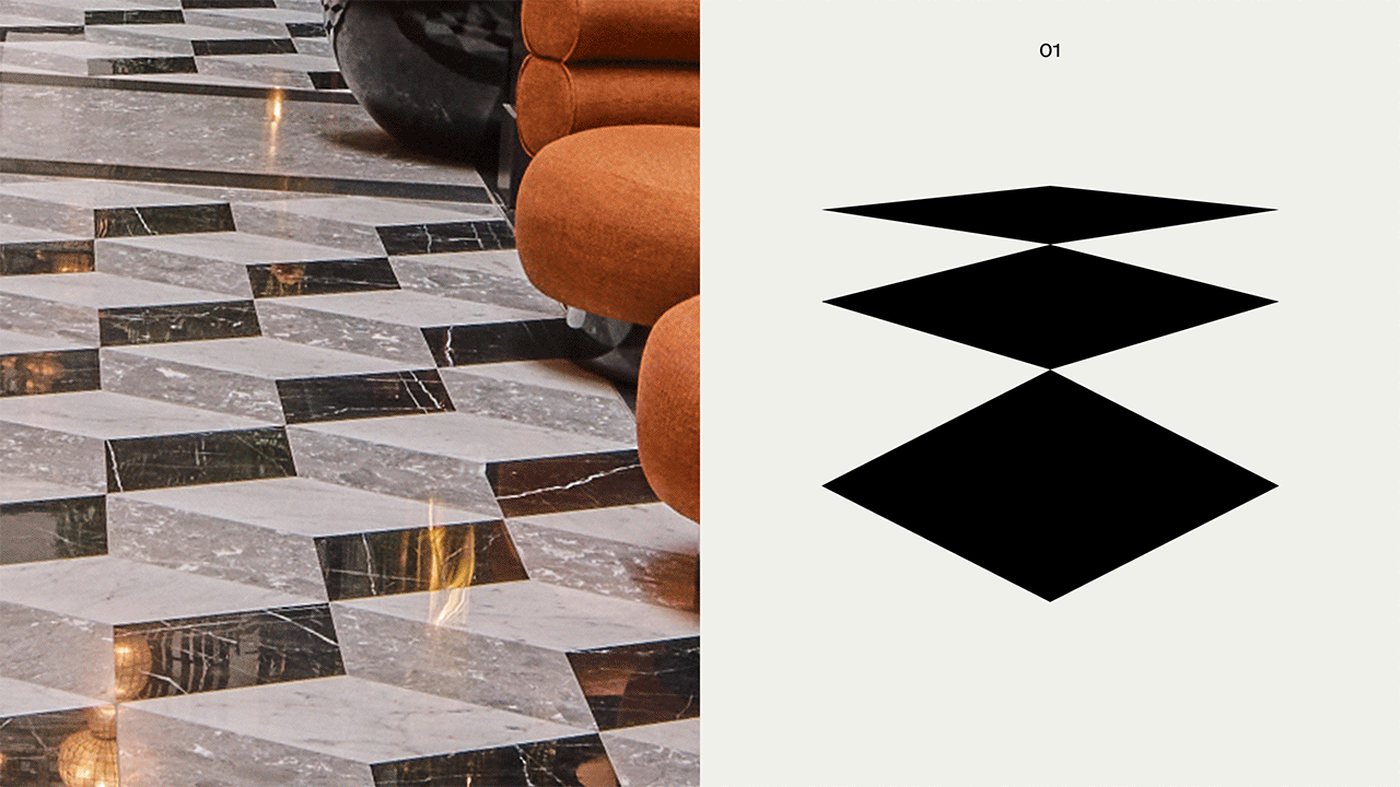
The graphic language suite draws inspiration from quintessential Singaporean character – like the distinctive shophouse architecture, or the flourishes of colonial design. These shapes add depth and provide a unique perspective to look through to Jill Tran’s vibrant illustrations.


At the heart of the brand identity lies Jill Tran’s mesmerising depictions of Singapore. From a peacock sipping on a Singapore Sling, to a tiger tea party, Jill’s unexpected perspectives provide a rich connection to place, truly reflecting how ‘When the lines blur, things get interesting’.


Relevant Projects

Houston Group acknowledges Aboriginal and Torres Strait Islander peoples as the Traditional Custodians of Country throughout Australia. Our studio sits on the traditional lands of the Gadigal people of the Eora nation and Wurundjeri people of the Kulin, and we pay our respects to their Elders past and present.
Check out our reconciliation action plan