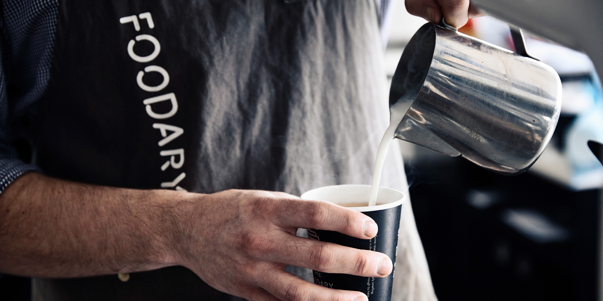
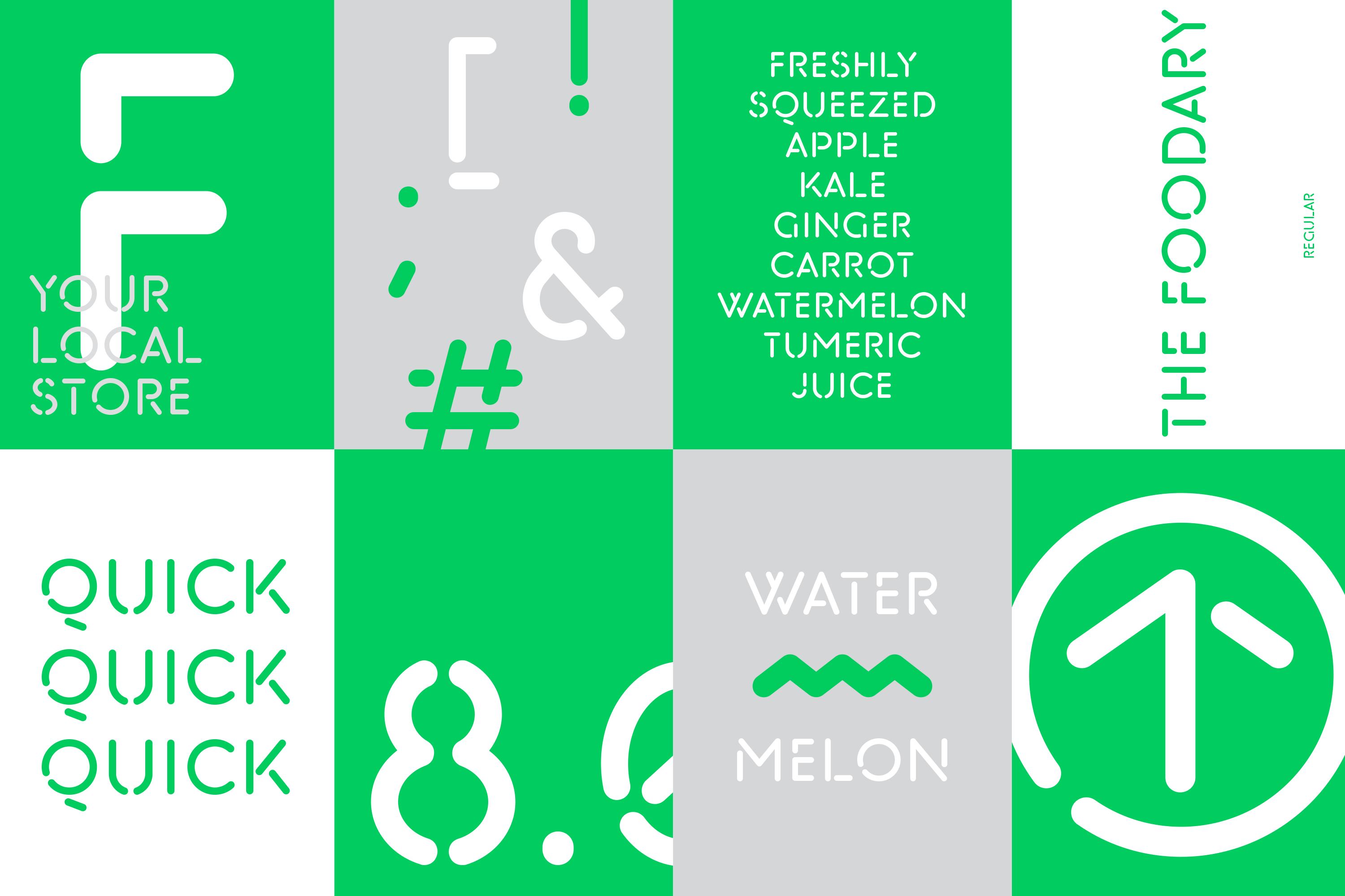
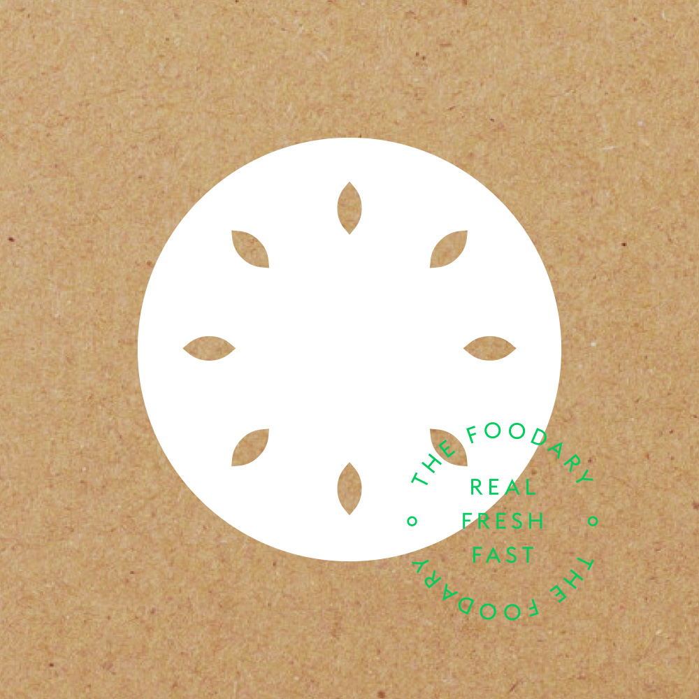
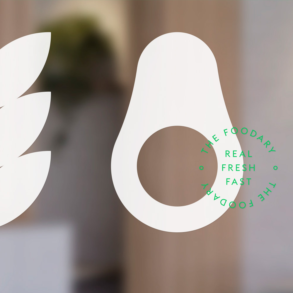
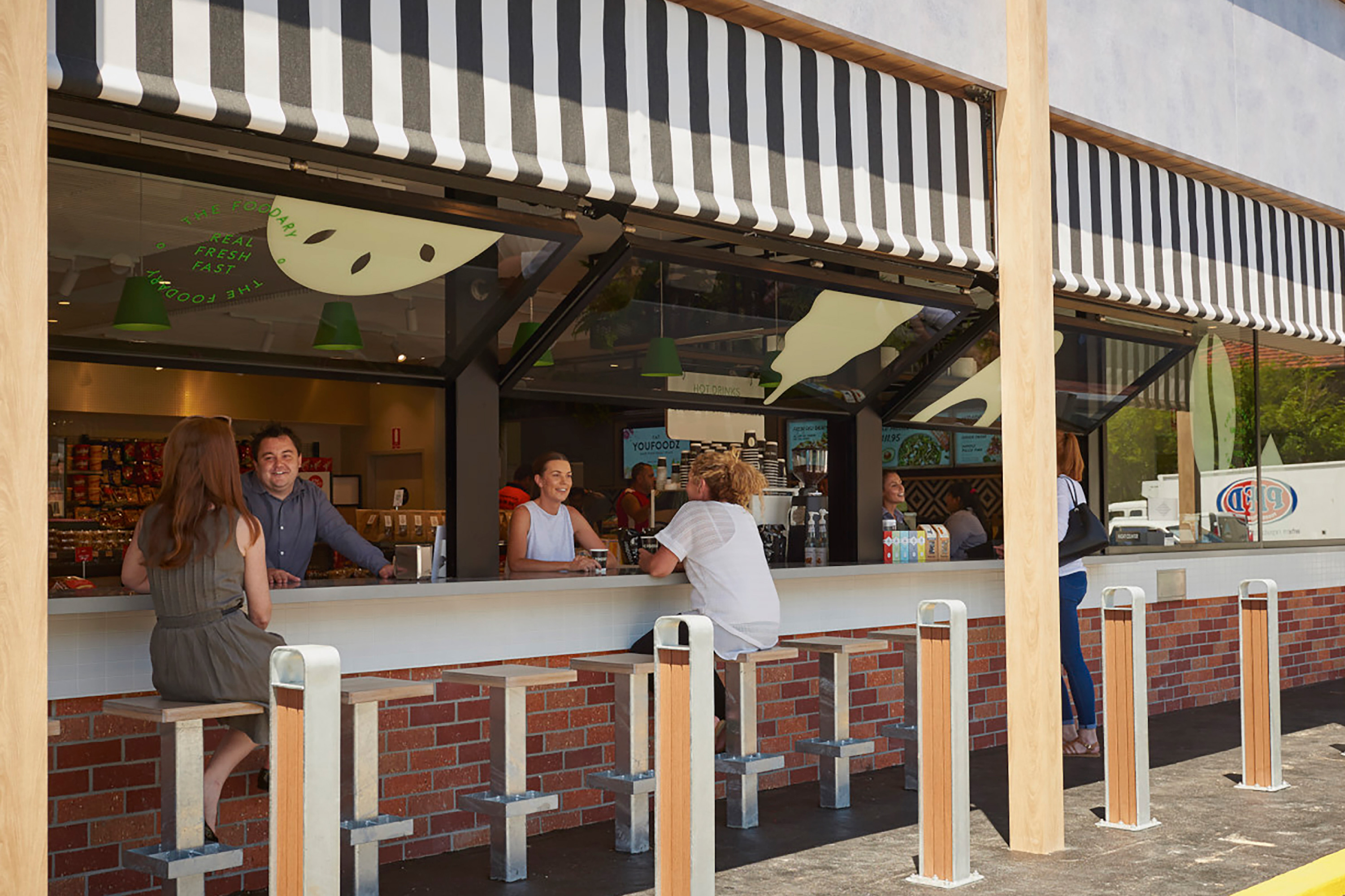
Caltex’s new convenience hub was created to meet the changing needs of consumers in a rapidly evolving convenience industry. With a focus on fresh, deli-style food in an urban café-style environment, it disrupts usual expectations of the petrol station experience. A system of environmental graphics was created to reinforce the brand’s central real fresh fast message. This included a suite of illustrations boldly applied to evoke the fresh produce offer. Externally, black and white awnings bring a local corner store feel, while internally, the graphic language creates an intuitive navigational system and an unexpected sense of excitement.
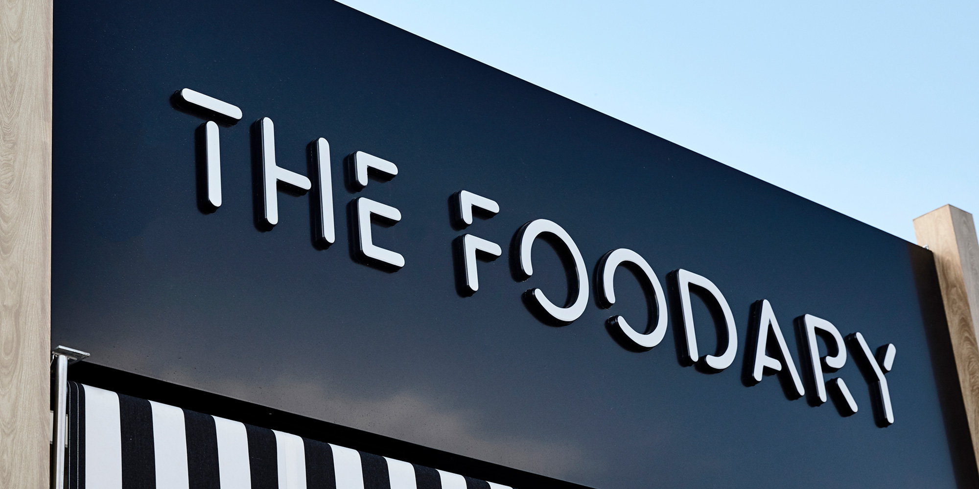
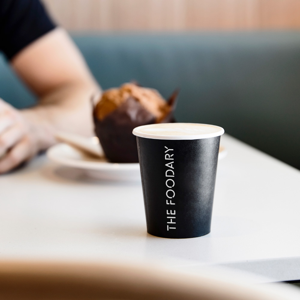
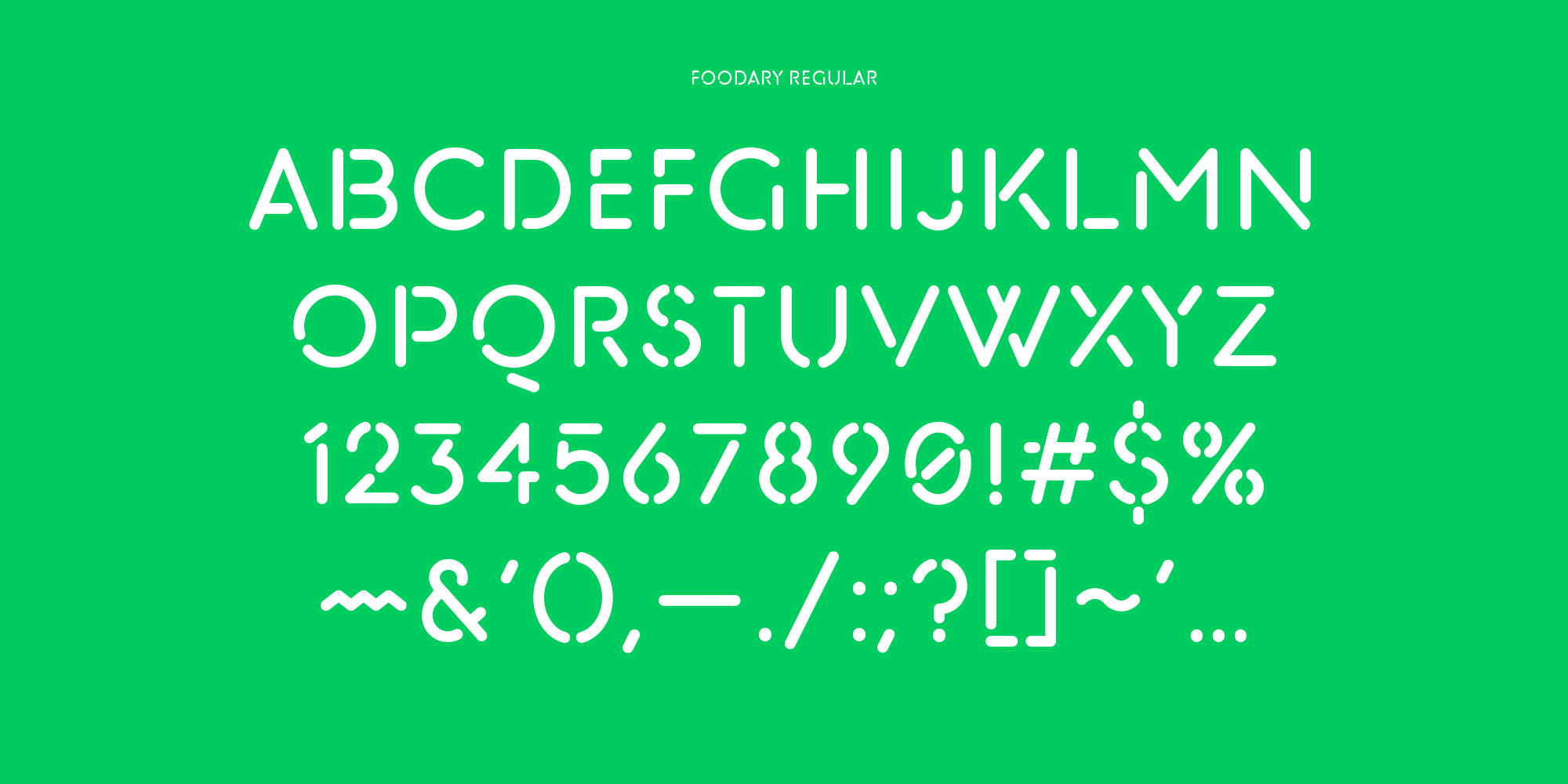
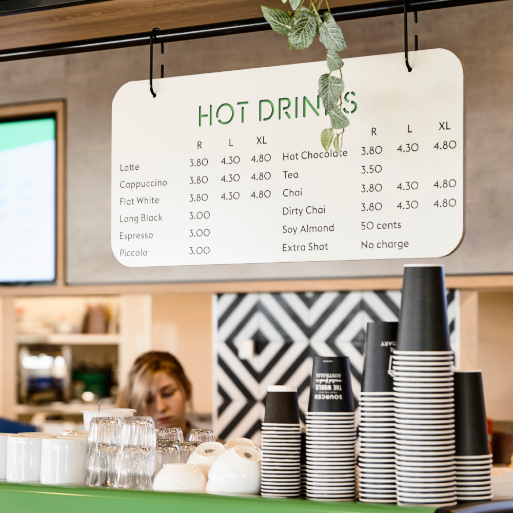
The typeface was inspired by sprayed stencils on old Australian flour sacks, bringing a sense of wholesome, back-to-basics quality to the Foodary’s cafe and bakery offer
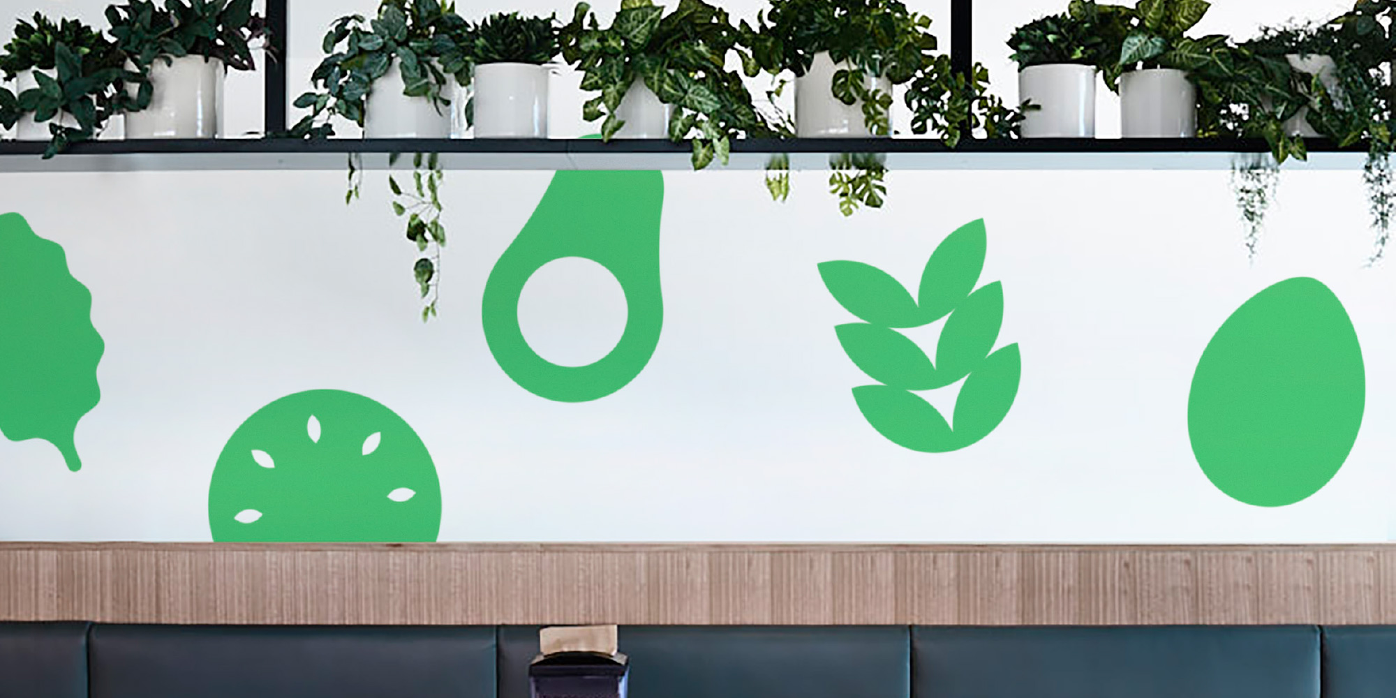
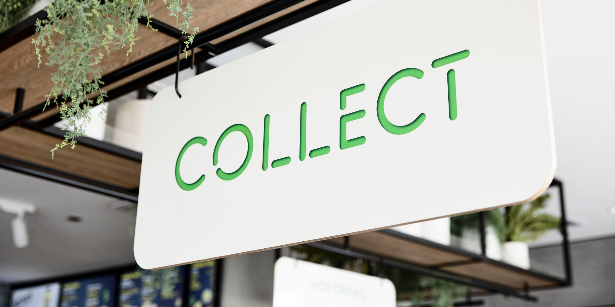
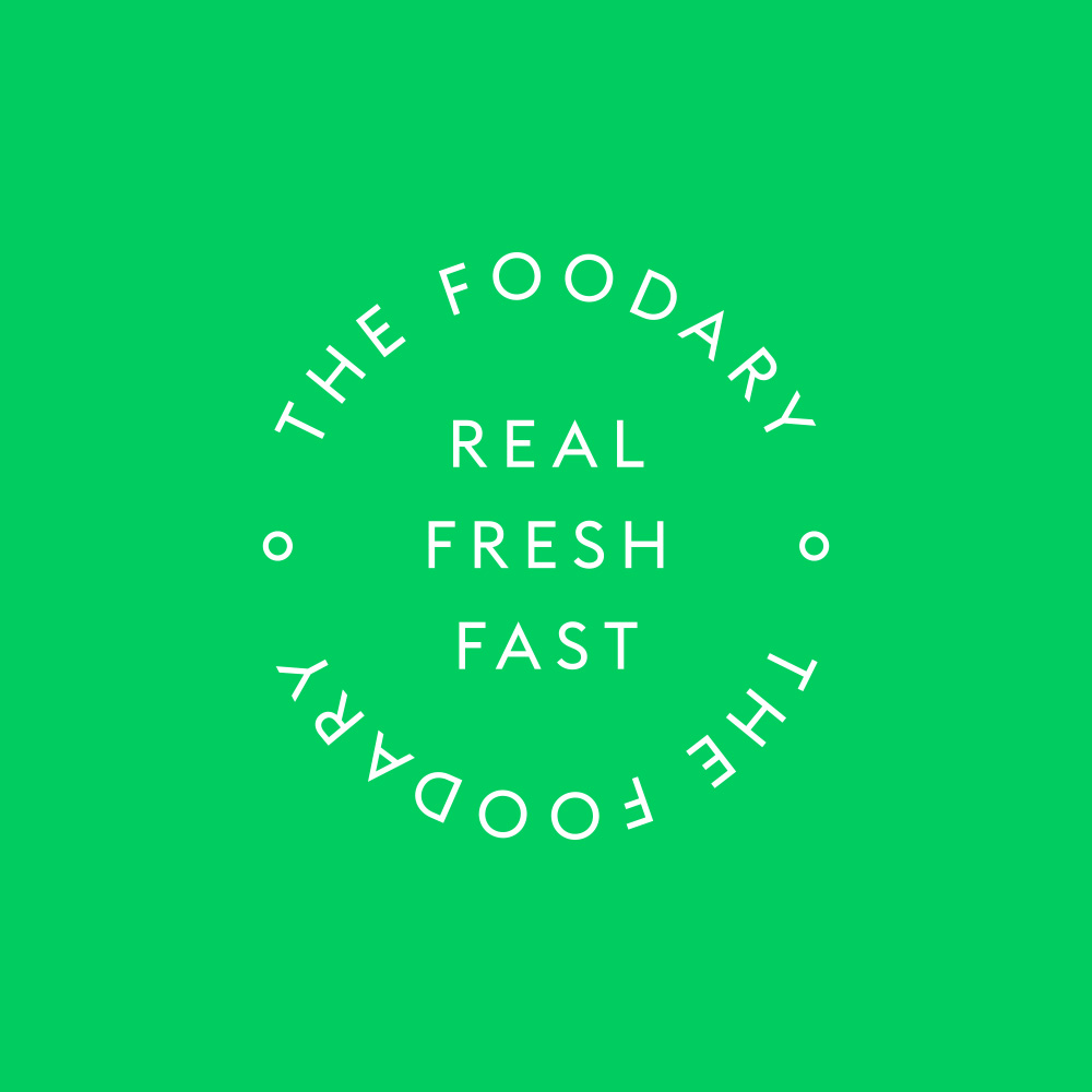
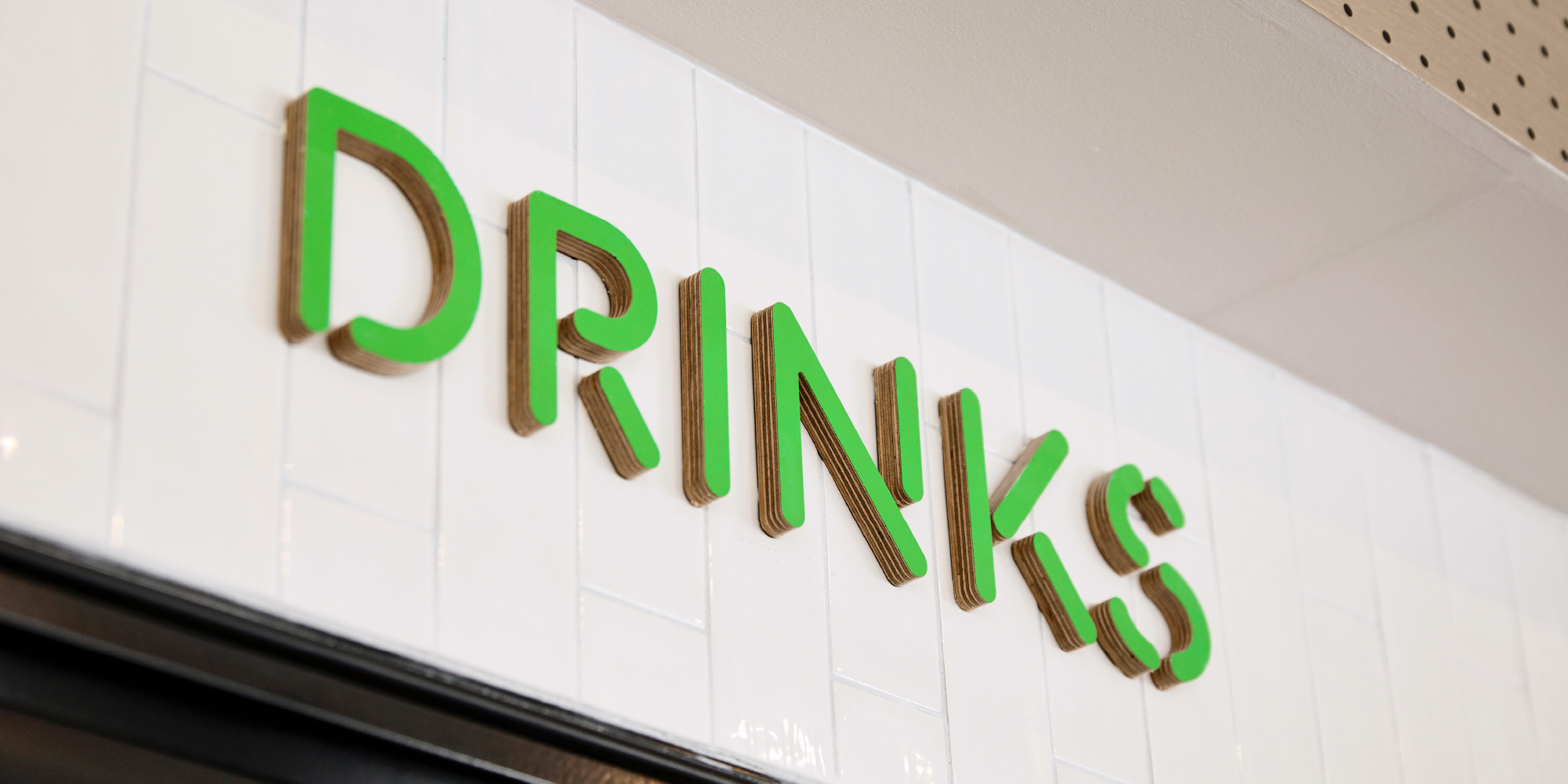
The graphic language creates an intuitive navigational system and an unexpected sense of excitement